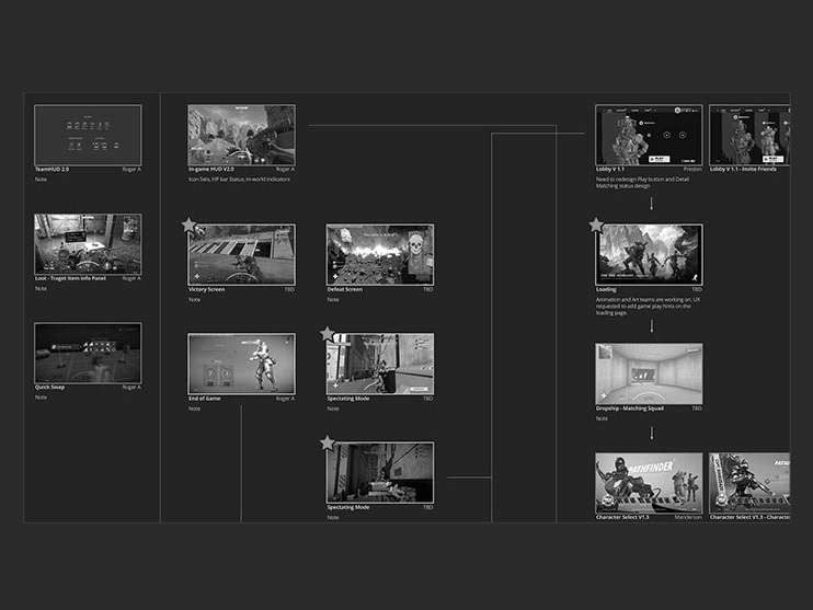
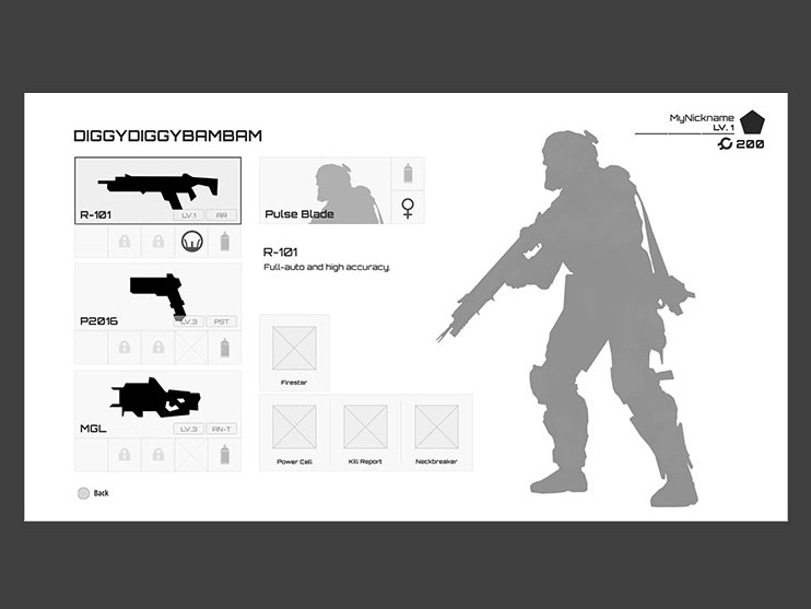
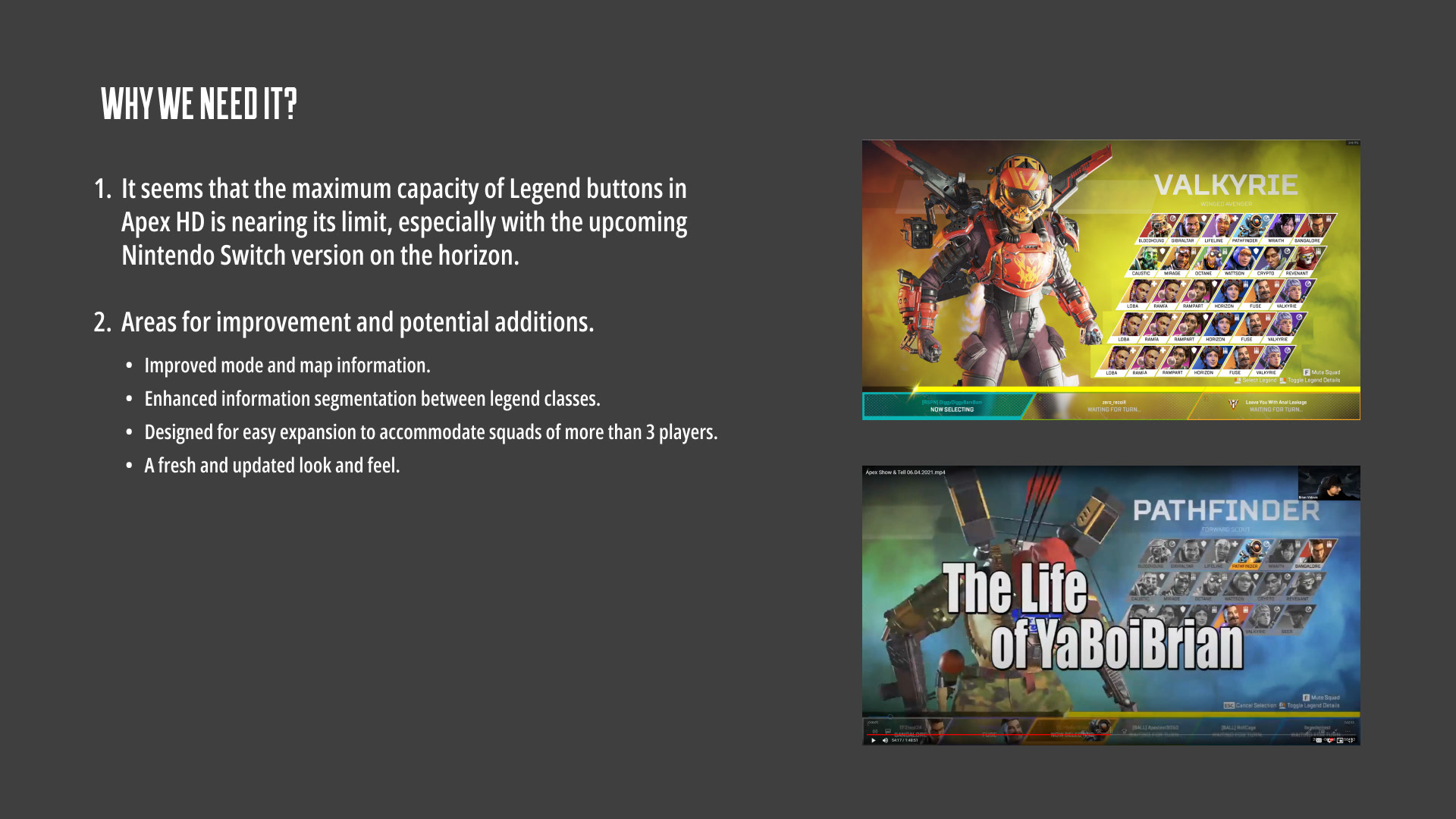
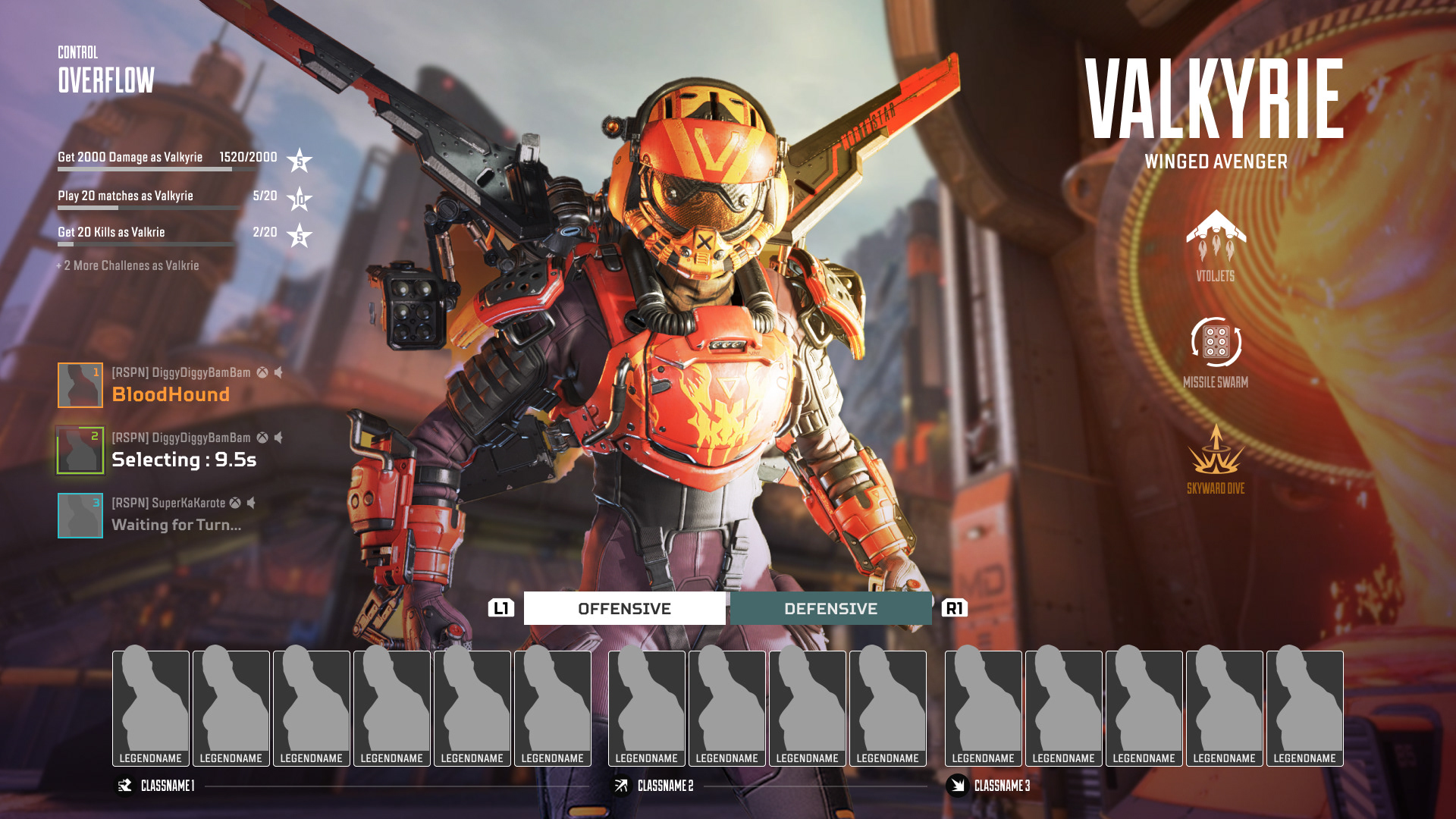
The goal of this character select revamp is to establish a sustainable approach for adding characters to a single screen in future seasons. Simultaneously, it aims to enhance the game's meta and strategy, particularly during the pre-battle phase, in response to community feedback and demands.
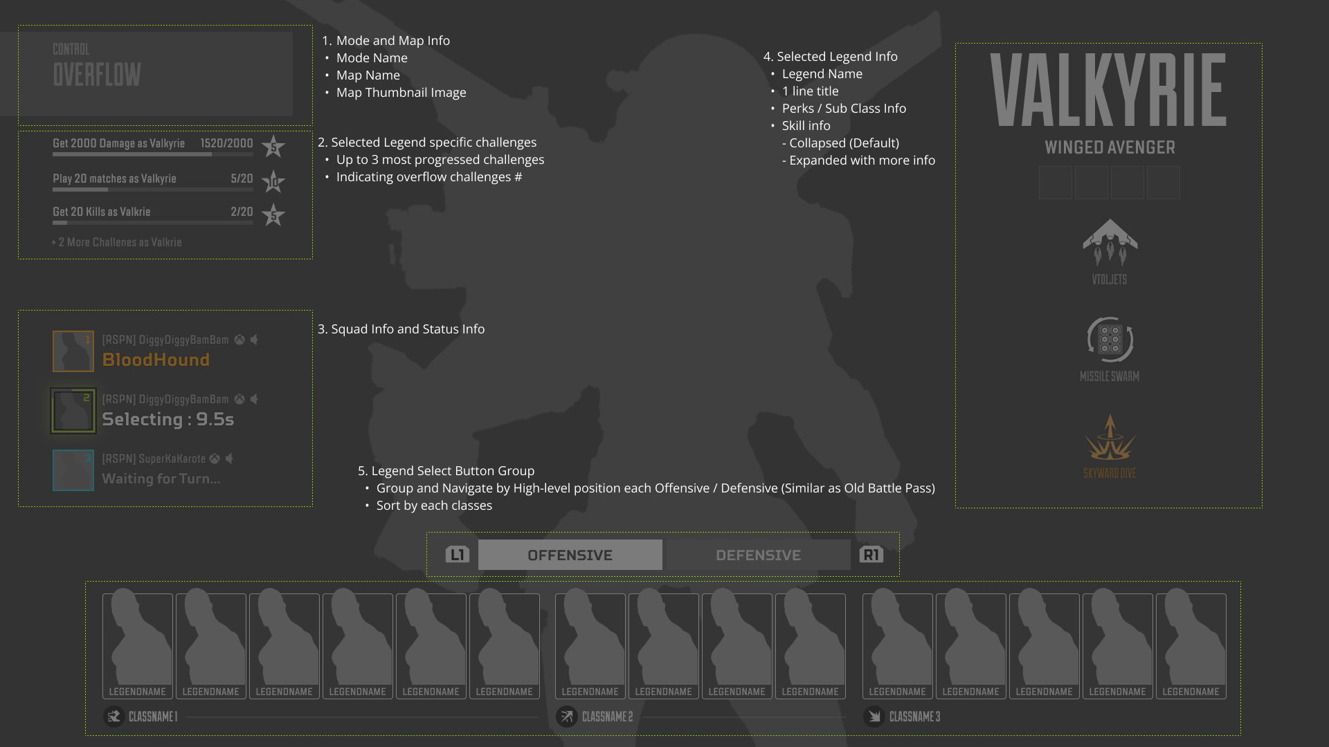
Main Wireframe of Character Select 2.0

UX/UI Feature Guide
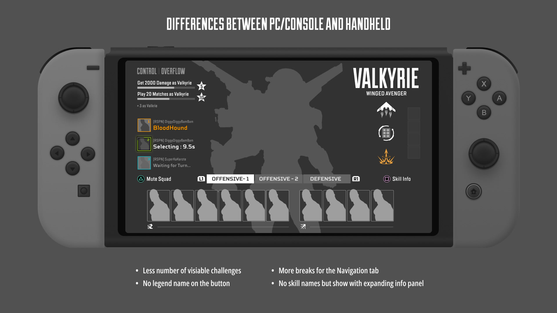
The new UX/UI design seamlessly accommodates handheld devices, such as the Nintendo Switch and Steam Deck.
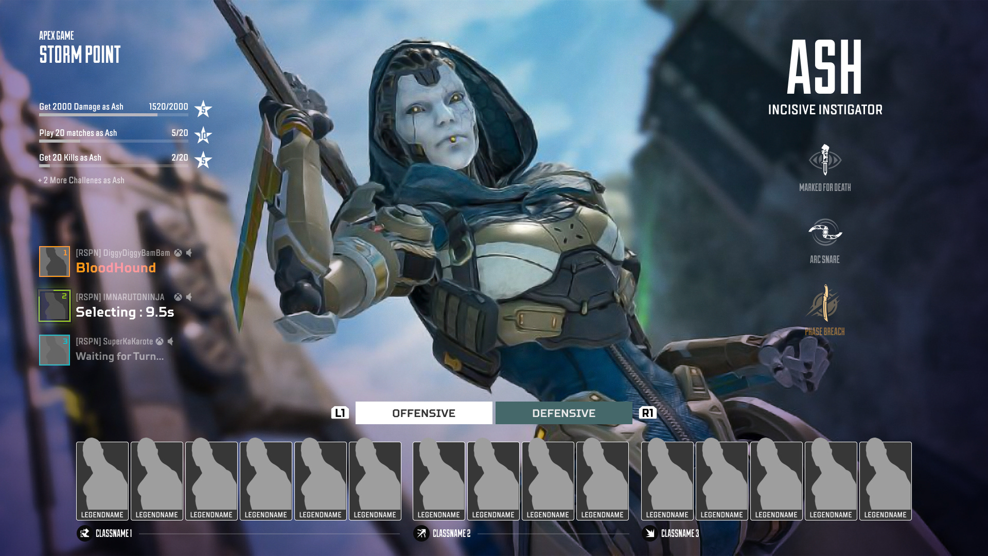
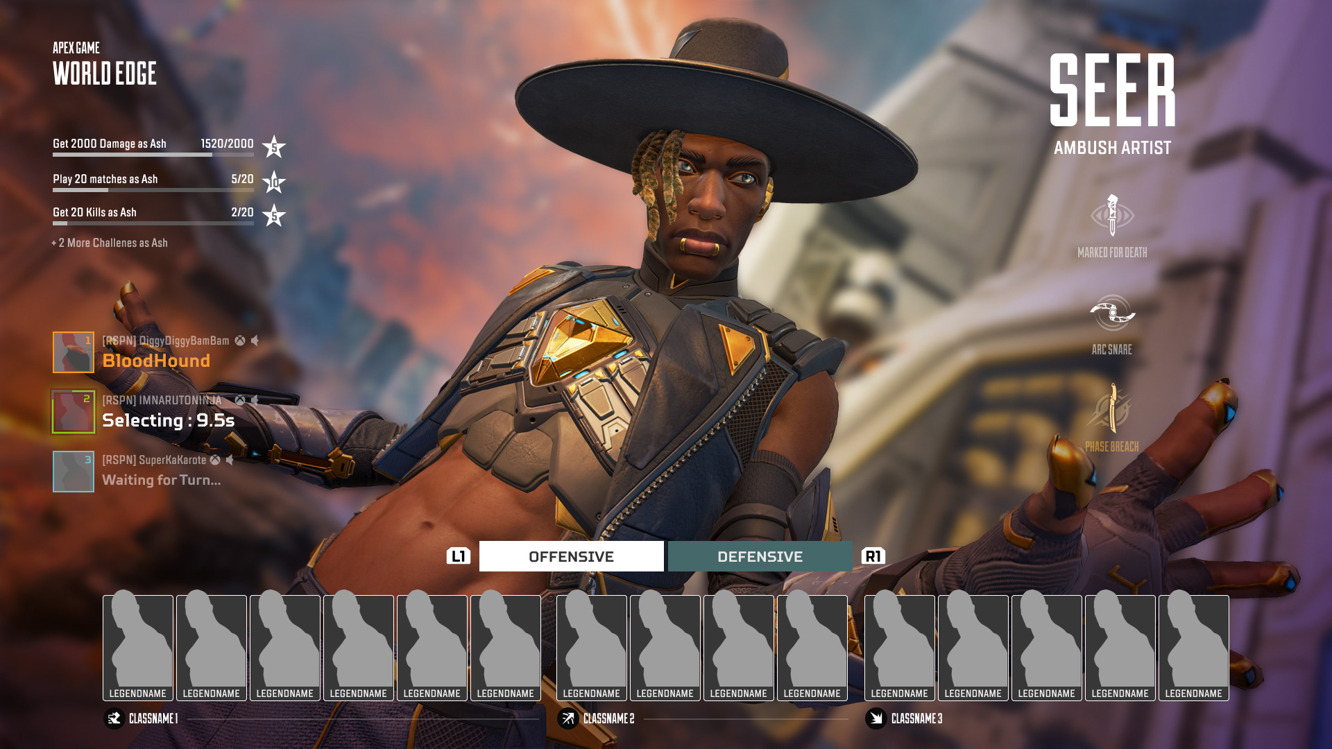
Random UX Idea 1: Adding battleground geographical features
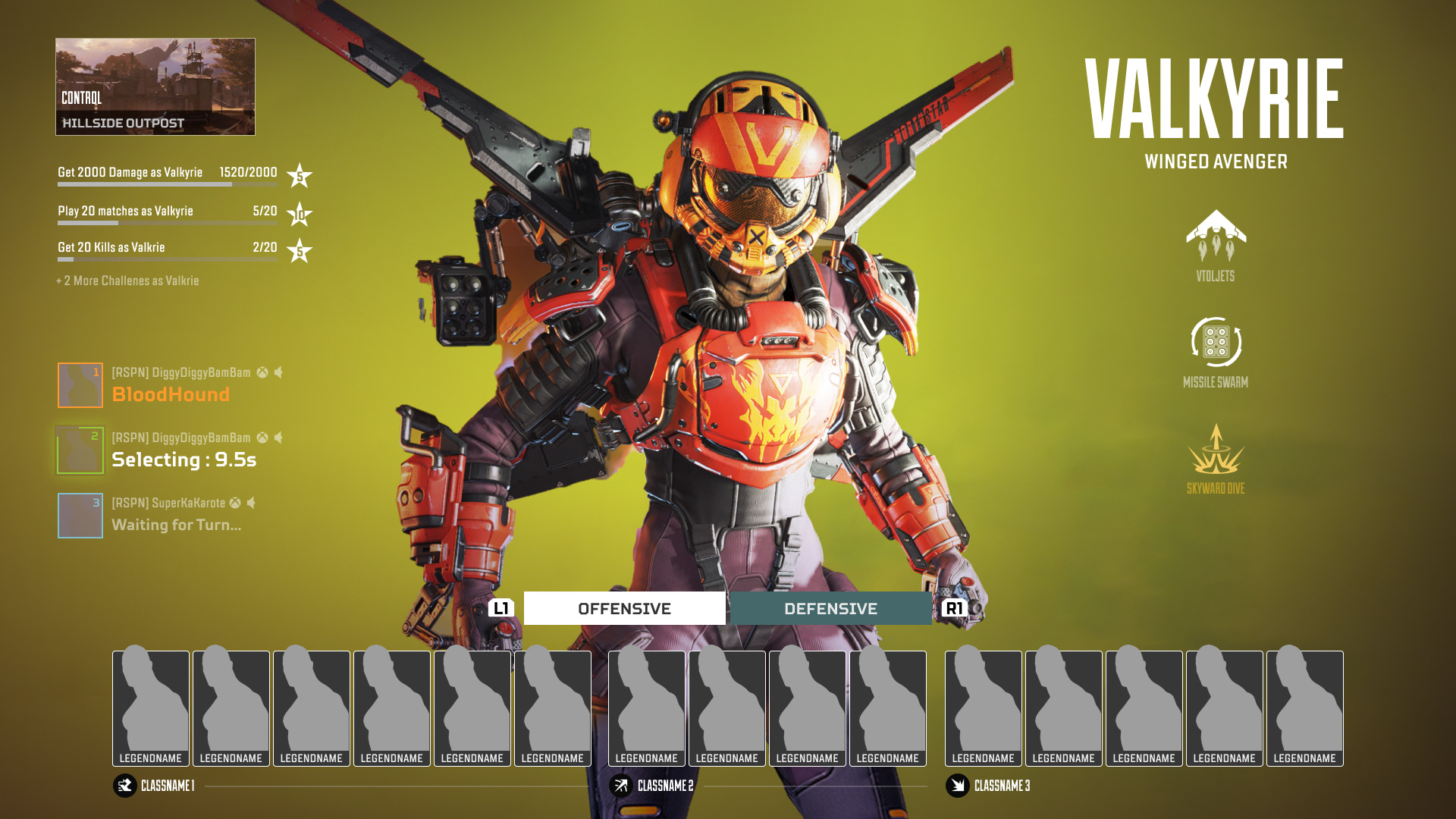
Knowing about the next battleground can significantly benefit pre-strategy setup for combat. While a simple 2D thumbnail and name of the battle area suffice, adding a full 3D geographical model would be a more dramatic and exciting addition.
Knowing about the next battleground can significantly benefit pre-strategy setup for combat. While a simple 2D thumbnail and name of the battle area suffice, adding a full 3D geographical model would be a more dramatic and exciting addition.
Compare 2D UI widget vs 3D geo background
A couple of more references with 3D geo BG
-
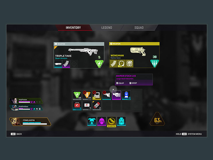
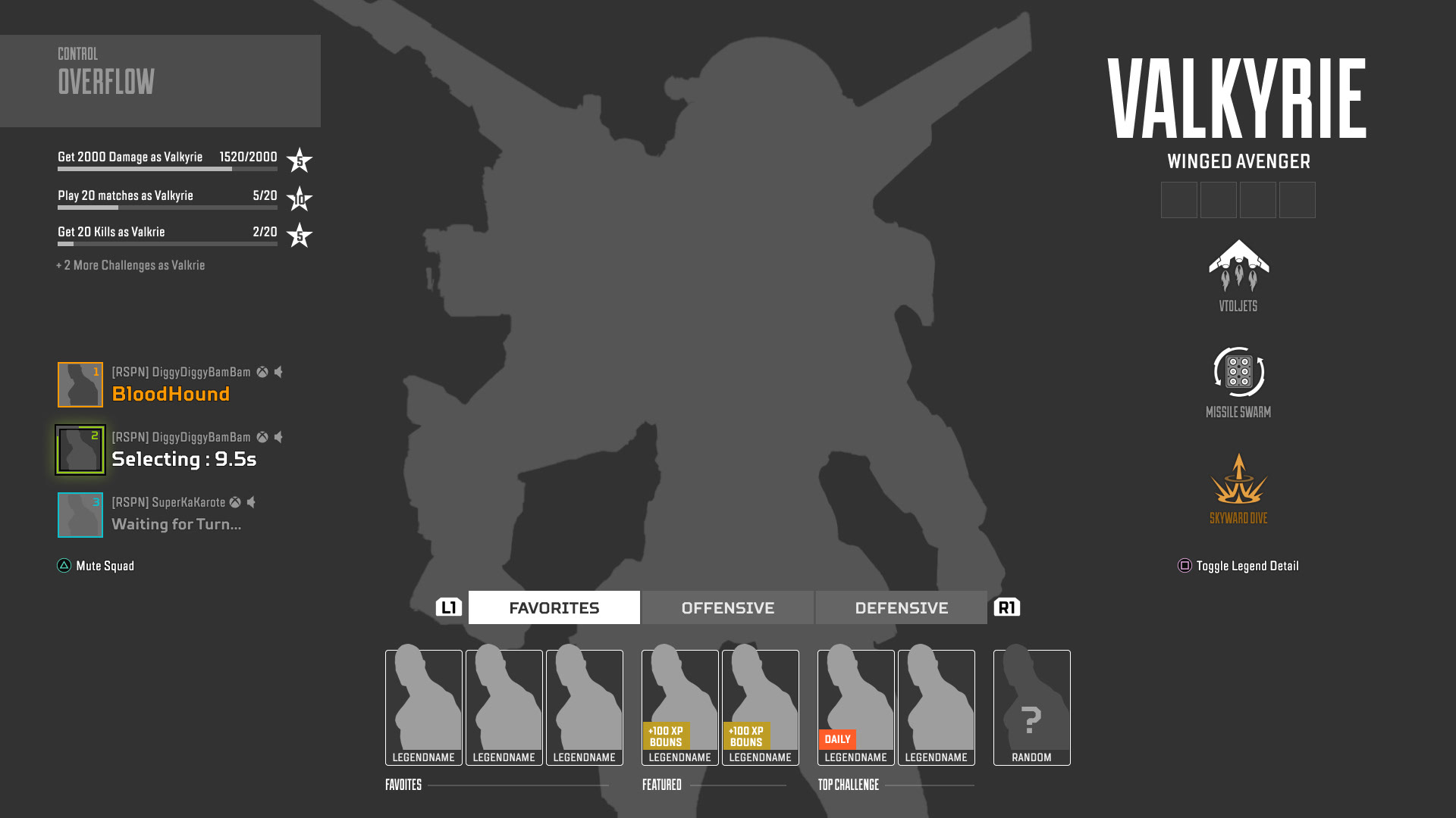
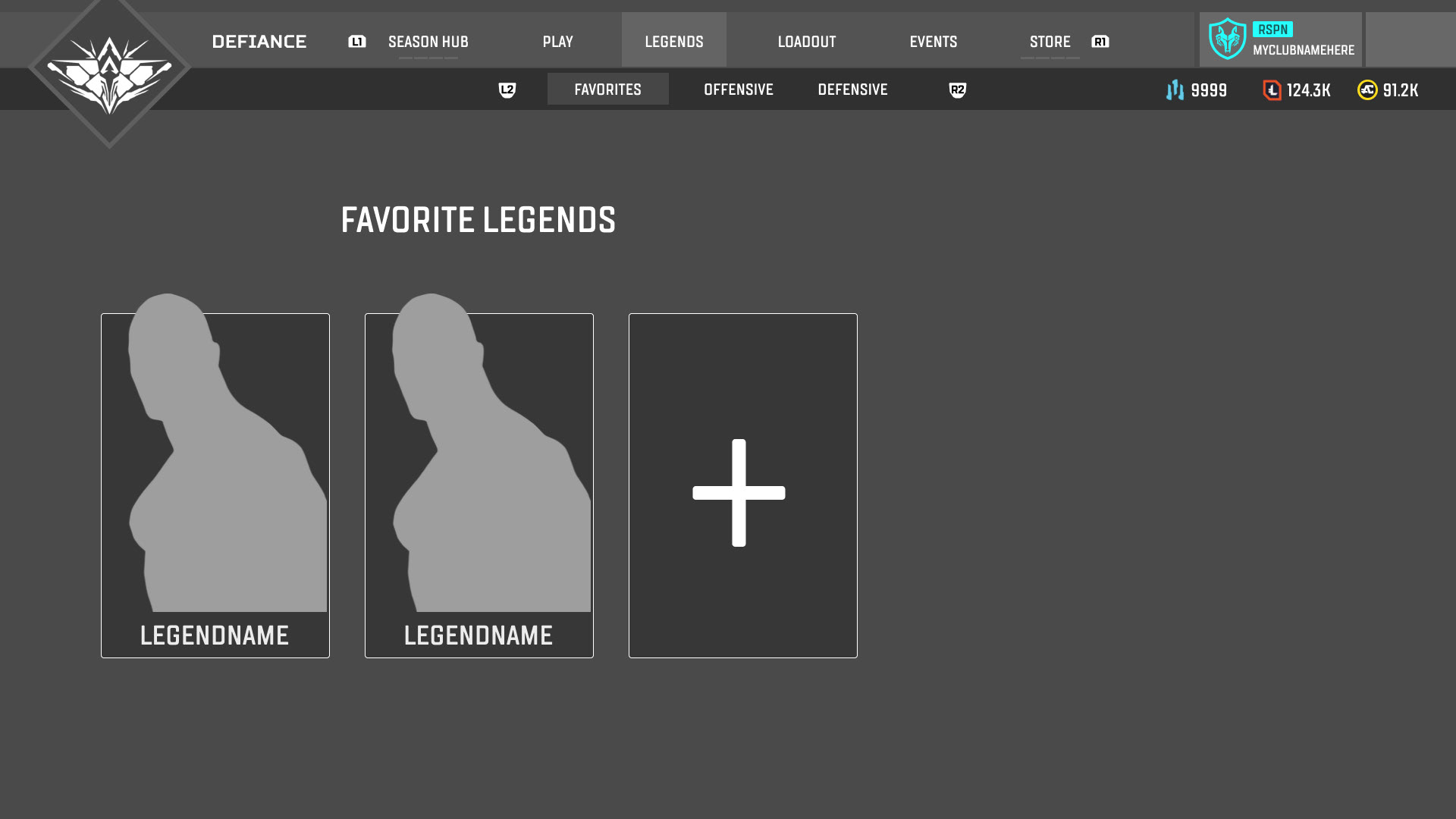
Random UX Idea 2: Favorite Tab
Many Apex players have their favorite characters, and Daily/Weekly Challenges often require specific characters. The "Favorite" tab contains a player's preferred legend choice (manually choose) from the lobby menu and intelligently suggests challenge-related characters to enhance the overall Apex progression design.
Many Apex players have their favorite characters, and Daily/Weekly Challenges often require specific characters. The "Favorite" tab contains a player's preferred legend choice (manually choose) from the lobby menu and intelligently suggests challenge-related characters to enhance the overall Apex progression design.
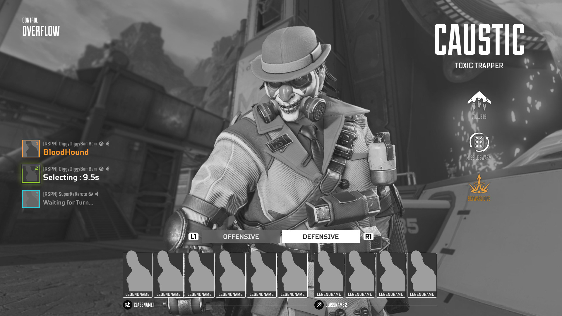
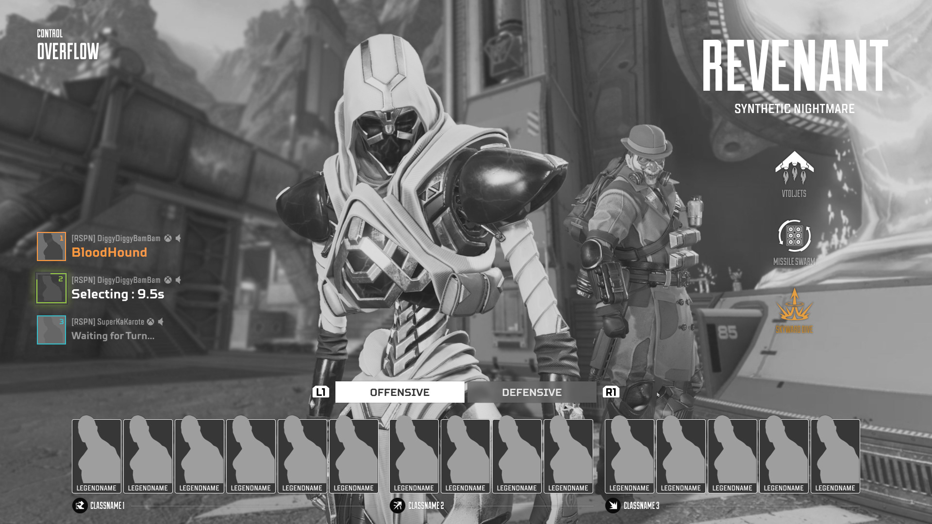
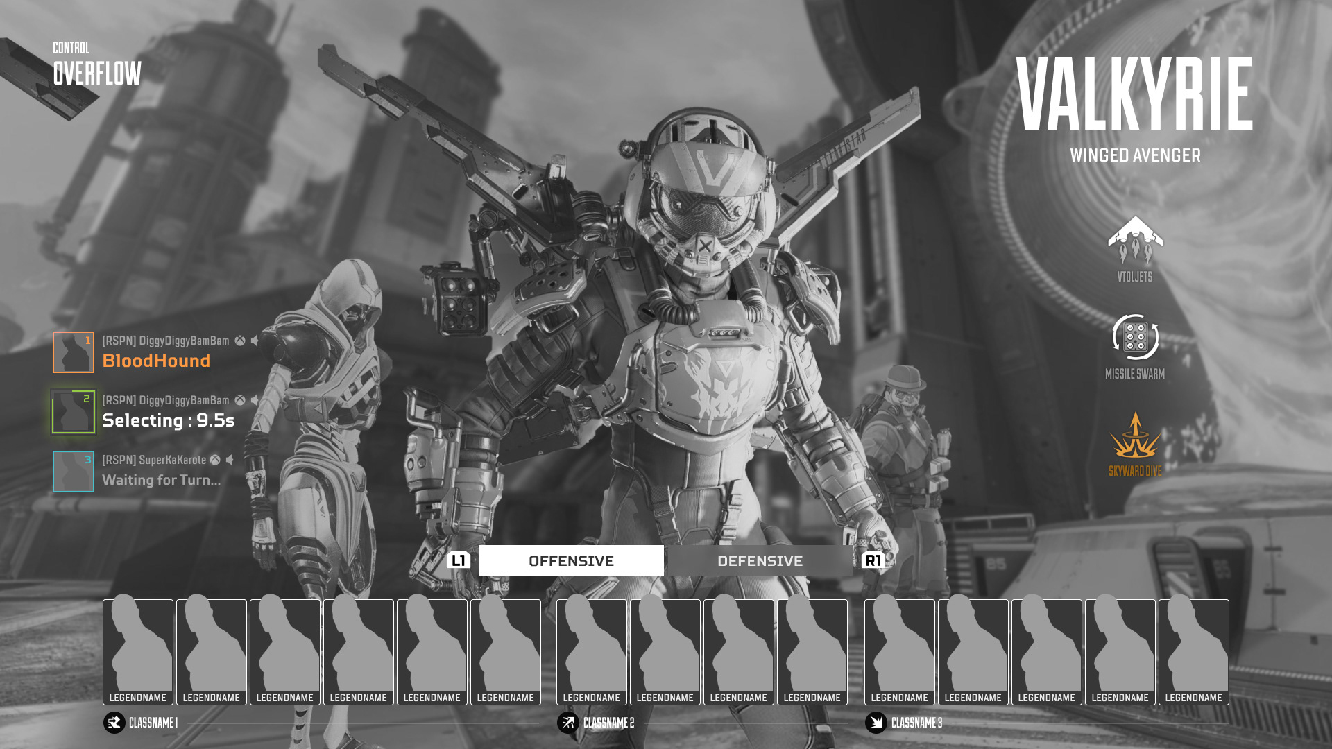
Random UX idea 3: Showcase Full squad 3D models.
Additionally, offering full squad 3D models during the legend selection phase would not only improve teammate awareness but also allow players to display their skins. This addition could also have marketing benefits for the our business model by gently encouraging player engagement.
Additionally, offering full squad 3D models during the legend selection phase would not only improve teammate awareness but also allow players to display their skins. This addition could also have marketing benefits for the our business model by gently encouraging player engagement.
-
-
Thank you